Creative Minds 𖹭 Happy Hearts

Healing in Layers Coloring Page, Onion with Tiny Tears
Layered, self-aware, and mildly hazardous to eye contact: the healing in layers coloring page pairs genuine growth with a crying onion who gets it.
Bold mixed lettering fills the page from the scalloped outer border to the ribbon banner in the middle, spelling out ‘I am healing in layers, like an onion, and also making people cry.’ Each word block uses a different interior pattern, from chevrons and waves in LAYERS to raindrop fills in CRY, so the page rewards slow, deliberate coloring. A kawaii onion character sits in the upper right corner, eyelashes out and a single tear on its cheek, adding a focal point that breaks up the lettering.
This is the Real Lifermations collection at its most committed to the bit. Colorists who enjoy pattern variety will find something different in every letter, while the scattered hearts, swirls, and teardrop accents around the border give the background its own quiet rhythm. The density makes it a longer, meditative session rather than a quick fill, but no section is so tight that it becomes frustrating.
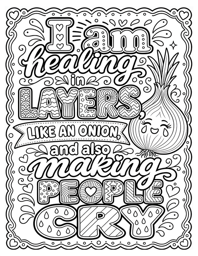
Crying onion and all, the healing in layers coloring page is packed with pattern-filled lettering and dry humor. Free instant download.
Getting the Most From Your Healing in Layers Coloring Page

Usage Notes
Gel pens shine here because the patterned letter interiors are small and geometric, and a fine-tipped gel pen gives you clean edges without bleed. Blending pencils work beautifully on the large script letters like ‘healing’ and ‘making,’ where you can layer two shades and blend for a soft gradient effect. Alcohol markers are worth using cautiously: they move fast, which can be an asset on the banner ribbon but a liability inside the tightly patterned block letters.
Printing Tips
Card stock at 65 lb or heavier prevents gel pen and marker bleed-through and keeps the fine interior patterns crisp. If your printer allows a ‘best’ or ‘high quality’ setting, use it here since the small geometric fills inside each letter can lose definition at draft quality.