Creative Minds 𖹭 Happy Hearts

Release the Need to Be Right Coloring Page, Banner and Bold Letters
Letting go is easier when you are only surrendering the unimportant arguments. The release the need to be right coloring page puts that very specific, very relatable truth right in front of you.
Chunky mixed-style lettering fills nearly every inch of the page, with ‘be right’ and ‘Unimportant’ rendered in oversized block letters packed with spirals, waves, chevrons, and small diamonds. A ribbon banner runs through the middle carrying ‘but only,’ while script words like ‘the need to’ and ‘things’ offer softer contrast. Scattered hearts, leafy sprigs, and a dotted pill-shaped border frame the whole composition without crowding it.
The real coloring payoff lives inside those large block letters, each one filled with a different zentangle-style pattern. The release the need to be right coloring page rewards slow, deliberate sessions, one letter section at a time, and the mix of tight pattern areas and open script strokes keeps the experience from feeling monotonous.
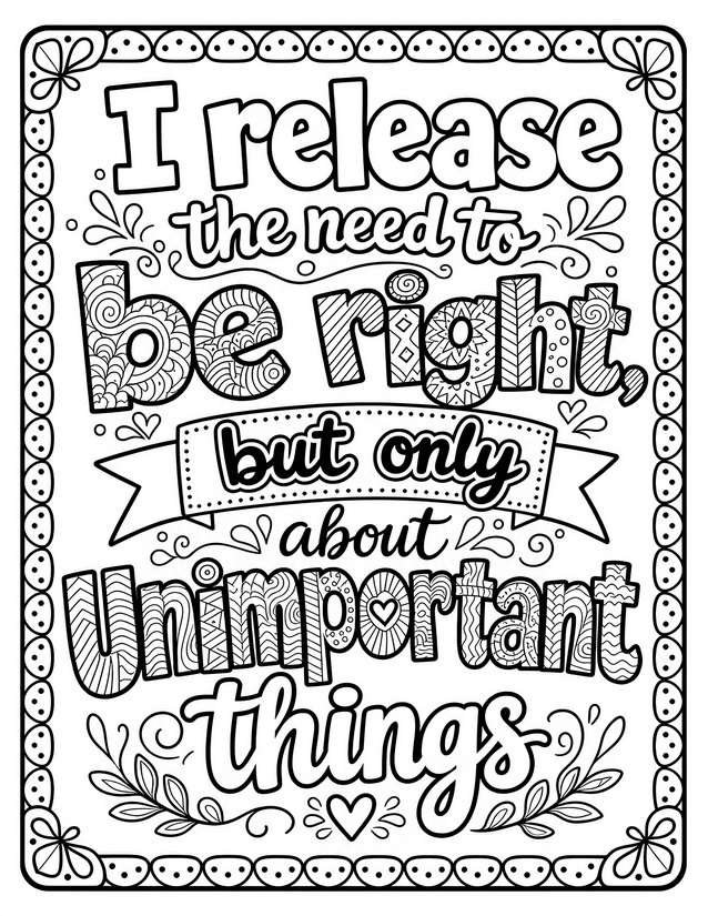
Affirm your peace with this release the need to be right coloring page. Packed with patterned lettering and free to print instantly.
What to Reach for With the Release the Need to Be Right Coloring Page

Usage Notes
Alcohol markers are a natural fit for the large, pattern-filled block letters here since the wide open sections reward smooth, even coverage. Switch to fine liners to trace the tiny spirals and chevrons inside each letter before layering color, which keeps the detail readable. Colored pencils work well on the script words and leafy border details, though avoid them on the largest letter fills unless you have patience for heavy layering.
Printing Tips
Card stock between 65 lb and 80 lb handles alcohol markers without bleed-through and keeps the bold outlines crisp. If your printer has a draft or ink-saving mode, skip it here since the thick black borders need full ink density to look intentional rather than faded.