Creative Minds 𖹭 Happy Hearts

Choose to See My Worth Coloring Page, Bank Account Disagrees
Your bank account has opinions, but the choose to see my worth coloring page gets the final word. Highly decorative, mildly petty, and deeply relatable.
Every word in this piece pulls its own visual weight. Bold bubble letters fill out ‘bank account’ and ‘opinion’ with stripe and dot patterns inside, while ‘worth’ runs in an italic script with dramatic flair, and ‘contradicting’ curls across a ribbon banner flanked by dollar signs. Hearts, swirls, and starburst accents fill every gap inside an ornate scrolled border.
Part of the Real Lifermations collection, this choose to see my worth coloring page rewards slow, deliberate work. The interior patterns inside each oversized letter are small and precise, giving you satisfying micro-tasks between the looser decorative fills. It lands somewhere between meditative and quietly funny, which is a pretty good place to sit.
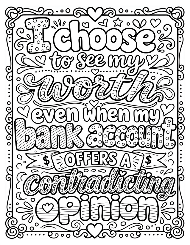
Funny and grounding, this choose to see my worth coloring page captures the eternal budget versus self-esteem conflict. Free instant download.
Getting the Most From Your Choose to See My Worth Coloring Page

Usage Notes
Watercolor pencils work beautifully here for the script lettering, letting you blend soft gradients inside ‘worth’ and ‘contradicting’ without losing the fine outlines. Gel pens are excellent for dotting the polka-dot interiors of ‘bank account’ and adding shine to the dollar sign accents. Keep alcohol markers away from the tighter striped sections inside the bubble letters, since bleed can swallow those thin lines fast.

Printing Tips
Cardstock at 65 lb or heavier keeps the page from warping if you use watercolor pencils with any moisture. Scale to 100 percent rather than fit-to-page so the smaller interior patterns inside each letter stay crisp and colorable.