Creative Minds 𖹭 Happy Hearts

Energy of Vague Hopefulness Coloring Page, LACK and VAGUE Lettering
Somewhere between manifestation and a shrug lives the energy of vague hopefulness coloring page, and honestly, it might be your most relatable affirmation yet.
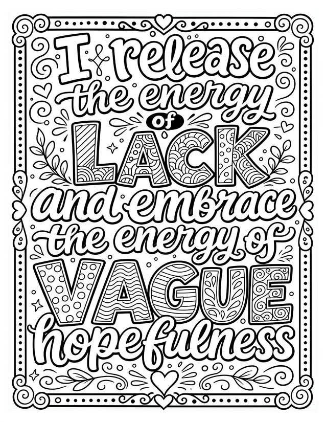
The composition fills the page with layered lettering at two scales: script lines like ‘I release the energy of’ and ‘and embrace the energy of’ flow between two massive block-letter words, LACK and VAGUE, each packed with its own interior pattern. LACK carries rainbow arches and wave fills, while VAGUE holds polka dots, horizontal lines, and a tiny floral motif inside the U. A dotted border with corner scrolls and small hearts frames the whole thing, and sprigs of leaves tuck in at the sides and bottom.
The block letters in LACK and VAGUE are where most of the coloring time will go, since each letter uses a different internal pattern that rewards careful color separation. The script lettering is bold enough for easy fills but has enough curve variation to stay interesting. Part of the Real Lifermations collection, this energy of vague hopefulness coloring page lands somewhere between dense and meditative, a good length session without tipping into overwhelming.
Release lack, embrace vague hopefulness. This energy of vague hopefulness coloring page is funny, free, and ready to print instantly.
What to Reach for With the Energy of Vague Hopefulness Coloring Page

Usage Notes
Colored pencils let you blend different shades within each block letter pattern, which is worth doing since LACK and VAGUE each have four or five distinct fill zones. Fine liners in a few accent colors work well on the smaller script text without bleeding into adjacent areas. Use alcohol markers cautiously on the tightly patterned interiors of the block letters, since the shapes are small enough that bleeds will muddy the pattern contrast.

Printing Tips
Bump the scale to 100 percent and skip any auto-fit setting so the border lands close to the page edge as intended. A cardstock weight of 65 lb or heavier is worth it here because the block letters invite layering, and lighter copy paper will buckle under multiple colored pencil passes.