Creative Minds 𖹭 Happy Hearts

Healing in Ways That Are Invisible and Expensive Coloring Page
Therapy copays, supplements, and crying in the car: the healing in ways that are invisible and expensive coloring page sees you, validates you, and gives you something to do with your hands.
Every letter in this piece is packed with tiny detail, floral sprigs tucked inside the ‘h’ of ‘healing,’ cross-hatching and dot fills inside ‘invisible,’ and swirling ribbon shapes behind ‘in ways.’ The ornate outer border layers hearts, scrollwork, and a dotted inner frame that frames the whole composition like something you would actually hang up.
This is the kind of page where you find a new small section every time you look. The mix of chunky outlined letters and tightly patterned interiors gives colorists two distinct modes, broad sweeping fills and slow, focused detail work. It sits squarely in the intermediate range and belongs to the Real Lifermations collection, where honesty and humor share the same page.
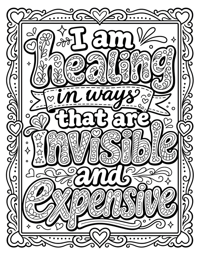
Acknowledge the real cost of growth with this healing in ways that are invisible and expensive coloring page. Free instant download, print-ready.
Best Tools for the Healing in Ways That Are Invisible and Expensive Coloring Page

Usage Notes
Watercolor pencils layered into the larger chunky letters like ‘Expensive’ reward a slow, blended approach and let the fills feel soft and luminous. Fine liners in multiple weights are excellent for the cross-hatched and dotted sections already drawn into the letterforms, where adding a second color with a thin-tipped tool keeps things tidy. Use alcohol markers cautiously on the tightly packed interior pattern areas, bleed is likely unless you work quickly and stay off the thinnest lines near the border.

Printing Tips
Card stock at 65 lb or heavier will hold up to watercolor pencils without warping, which matters given how much interior area this page invites you to wet-blend. Scale stays best at 100 percent so the smallest floral and dot details inside the lettering remain easy to color without squinting.