Creative Minds 𖹭 Happy Hearts

Nested Square Wave Grid Coloring Page, Concentric Squares and Rippling Lines
Rows of nested square wave grid panels lock together across the page, each one a bull’s-eye of concentric squares surrounded by tightly packed rippling lines.
Every panel in this design holds a set of concentric squares, shrinking inward ring by ring toward a tiny centered square at the core. Between those panels, diagonal wave lines sweep across in close parallel bands, giving the whole sheet a sense of motion that keeps the eye moving even when the pen is still.
Part of the Geometric Designs collection, this page rewards colorists who enjoy contrast work. Coloring the concentric rings in one family of shades and the wave fields in a contrasting tone makes the two systems snap apart visually. The detail level is high but rhythmic, so sessions feel steady rather than fiddly.
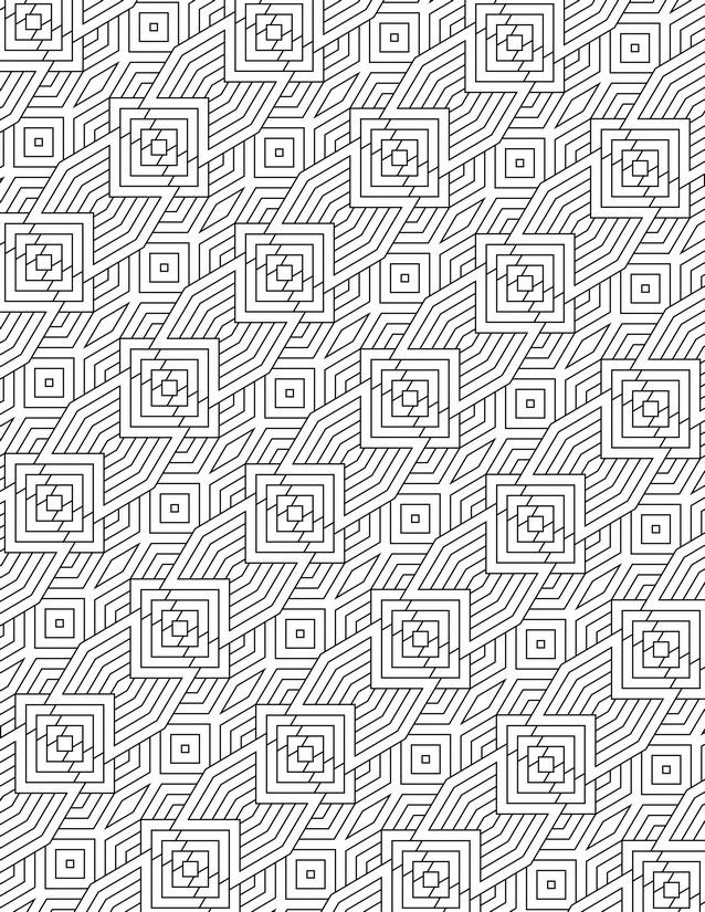
Bold concentric squares meet rippling diagonal waves in this nested square wave grid coloring page. Free instant download, ready to print.
Best Tools for Your Nested Square Wave Grid Coloring Page

Usage Notes
Alcohol markers cover the wave-line bands quickly and blend smoothly across the wider parallel strips, making them a strong first choice here. Colored pencils let you shade the concentric rings with gradual value shifts, giving each panel a sense of depth. Use fine liners with care in the innermost square rings, where the spacing is tight enough that a broad tip will flood adjacent lines.

Printing Tips
Sixty-five pound cardstock keeps the page from warping under marker ink, which is especially useful given how much of the surface the wave fields cover. If your printer allows it, scale to 105 percent to open up the innermost concentric rings just enough for easier coloring.