Creative Minds 𖹭 Happy Hearts

Purpose Is Powerful and Extremely Inconvenient to Pursue Coloring Page
Relatable, a little rude, and entirely true: the purpose is powerful coloring page puts the full inconvenient reality of chasing your goals into big, pattern-packed letters.
Every word in this design earns its space. ‘My Purpose is Powerful and extremely inconvenient to Pursue’ fills a bordered page wall to wall, with each headline word carrying its own internal pattern: diagonal stripes in ‘My’, polka dots and scallops in ‘Purpose’, bold chevrons across ‘extremely’. Stars, swirls, splashes, and ribbon banners fill every gap between letters, so the composition is genuinely dense from corner to corner.
Colorists who enjoy working inside tight, detailed fills will find plenty to keep them busy here, particularly inside the large letters of ‘Purpose’ and ‘extremely’, which hold the most intricate patterning. The smaller connector words like ‘is’, ‘and’, and ‘to’ offer quick breathers before the next big section. This is a Real Lifermations page that lands somewhere between a therapy session and a pep talk, and the session runs long.
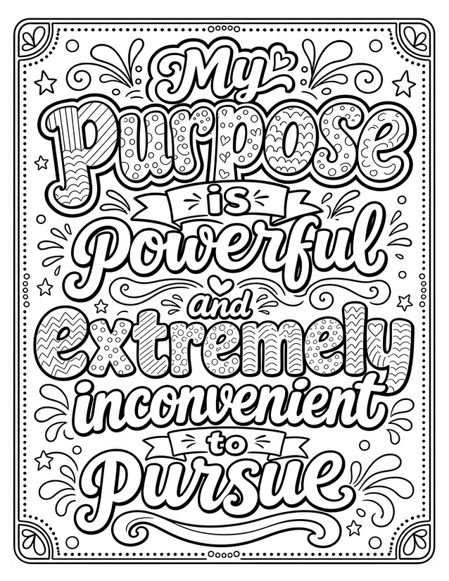
Affirm your drive with the purpose is powerful coloring page, packed with patterned lettering and honest humor. Free instant download.
How to Approach the Purpose Is Powerful Coloring Page

Usage Notes
Blending pencils earn their keep here by smoothing transitions between the multiple patterns packed inside each large letter, especially where diagonal stripes meet curved edges. Alcohol markers lay down fast, even coverage in the open banner areas and background swirls, making the bold lettering pop without muddying the fine interior lines. Use fine liners cautiously on the smallest connector word sections where the line weight is already tight and an extra ink layer can close up detail.
Printing Tips
Card stock in the 65 lb to 80 lb range handles the dense ink coverage this design demands, particularly in the heavily patterned letter sections that will soak up color from multiple passes. If your printer has a draft or ink-saver setting, skip it here: the fine interior patterning inside each letter needs a full-resolution pass to stay crisp and colorable.