Creative Minds 𖹭 Happy Hearts

Release Comparison Coloring Page, Unique Brand of Barely Coping
Releasing comparison sounds very zen until you finish the sentence. This release comparison coloring page completes the thought honestly, with patterned bubble letters and scattered hearts to keep you company.
Every letter in this design earns its own treatment: polka dots packed into bubble letters, diagonal stripes running through bold script, swirls filling rounded forms, and a ribbon banner cutting through the middle with ‘and embrace’ in clean line work. Botanical sprigs frame the lower half while hearts and stars dot the negative space, giving the whole page a chaotic warmth that matches the message.
The Real Lifermations collection runs on this kind of honesty, and this page delivers it at a medium-to-high complexity level. There is enough variety in the letter fills and the surrounding detail work to keep a coloring session genuinely absorbing without tipping into overwhelming. Open areas between the larger words let you breathe between the busier sections.
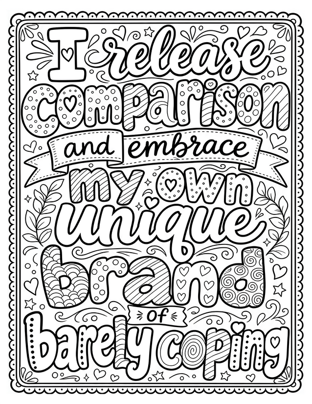
Ditch the scroll spiral with this release comparison coloring page. Packed with patterned lettering, scattered hearts, and botanical sprigs. Free instant download.
Getting the Most From Your Release Comparison Coloring Page

Usage Notes
Alcohol markers are worth reaching for on the larger bubble letters, where their smooth, even coverage handles the bold fills without patchiness. For the tighter areas inside the ribbon banner and the small botanical sprigs, fine liners in a range of weights add crisp definition without bleeding into neighboring sections. Use alcohol markers cautiously near the smaller hearts and stars scattered across the page, since the ink can spread past thin outlines if you linger too long.
Printing Tips
A heavier paper, at least 65 lb cardstock, keeps alcohol marker bleed from ghosting through to a second sheet underneath. If you are printing with a home inkjet, nudge the scale to 97 percent so the scalloped border clears the printable margin without clipping.