The Complete Beginner’s Guide to Adult Coloring: From First Page to Frameable Art
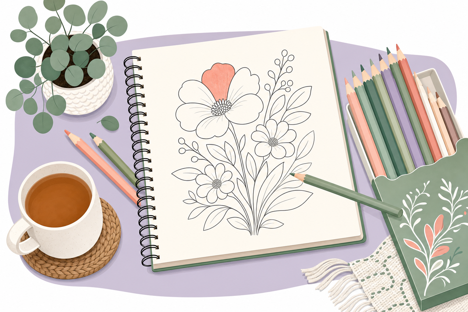
The book is open on the kitchen table, a fresh box of pencils fanned out beside it, and the first blank flower is staring back at you. You pick up a green, hover over the leaf, and freeze, because suddenly one choice feels like it might ruin the whole thing.
Sound familiar? Good news: it won’t ruin anything. Coloring is one of the few hobbies where the stakes are exactly as low as you want them to be, and yet the results can hang on a wall. This guide is your starting line. We’ll cover what actually separates a page that looks finished from one that looks flat, and I’ll point you toward the rest of the series so you can go deeper wherever you’re curious.
What “Pro-Level” Coloring Actually Means
Pro-level doesn’t mean expensive supplies or fine-art training. It means a handful of habits that add depth to an otherwise flat page. When people say a colored piece “looks professional,” they’re almost always reacting to the same few things:
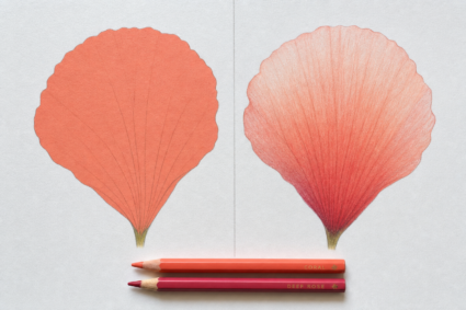
- Depth from light and shadow. Objects in the real world have a lighter side and a darker side. Add that, and a flat circle becomes a sphere you could pick up.
- Smooth, even blending. No streaks, no harsh borders between shades. The color moves from one tone to the next without you noticing the seam.
- A palette that holds together. Colors chosen on purpose rather than grabbed at random. This is where a page starts to feel intentional.
- Clean edges and controlled coverage. Staying inside the lines still matters, but so does knowing when to let color bleed on purpose.
Master those, and it almost doesn’t matter what’s in your pencil case. Beginners tend to obsess over gear first. The habits carry more weight.
The Foundation: How the Series Fits Together
Coloring well is a stack of small skills, and each one builds on the last. Here’s the path we’ll walk, and where each piece lives.
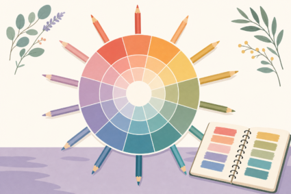
Start with your palette. Before a single pencil touches paper, deciding on your colors saves you from muddy, clashing results. We break down warm versus cool tones, complementary pairs, and how to build a palette that feels calm or bold on purpose.
Then get to know your tools. Colored pencils, alcohol markers, gel pens, and blenders each behave differently, and each opens up a different look. We compare them honestly so you can spend your money where it counts for the style you want.
Learn the core techniques. This is the heart of it: layering colors to build richness, blending them into smooth transitions, and placing shadows and highlights so your work lifts off the page. These are the skills that turn a nice page into a framed one.
Pick up the extras. Little tricks for texture, background treatments, fixing mistakes, and finishing touches that make the difference between “done” and “polished.”
You don’t have to read them in order. Bookmark this page, wander where your interest pulls you, and come back when you want the next step.
A Few Things to Know Before You Begin
Buy paper you like. Thin coloring-book pages buckle and bleed with markers. If you’re serious about results, printable pages on decent cardstock give you room to layer without the paper giving up.
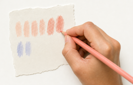
Practice Layering Colors on Scrap Paper Test on a piece of scrap paper first. Every marker and pencil behaves a little differently depending on the surface. A quick swatch tells you more than guessing ever will.
Go slow with your first layers. Light pressure, built up gradually, beats one heavy pass every time. You can always add more color. Taking it back is much harder.
Let it be imperfect. Your early pages are practice, and practice is supposed to look like practice. The wobbly ones teach you the most.
The next thing is choosing colors that work together.